Bright colours in interiors
How to add character without losing elegance
We are used to thinking of calm shades as the safest choice for interiors. Beige, grey, ivory, powder tones, pale olive - they seem universal, unobtrusive and easy to live with. Bright colours, by contrast, are often seen as a risk: too bold, too loud, too emotional, too difficult for everyday space. That is why saturated shades, when they appear at home at all, usually remain in supporting roles - in a vase, a cushion, a poster or a small decorative object.
But contemporary interior design has long moved beyond the idea that bright colour must be only a cautious accent. Used well, it can become the main architectural and emotional tool in a room. It can bring a space to life, set a mood, express the owners’ style and make a home feel truly individual. The key is to understand that a bright interior is not built on courage for its own sake, but on precision: proportion, light, texture and balance.
Saturated colour gives a room energy and inner rhythm. It tells the space what it is: alive, expressive, intentional, full of mood. At the same time, bright colour does not have to be aggressive. Deep blue can feel intellectual and calm, green can be fresh and natural, terracotta can be warm and refined, yellow can be sunny and optimistic, while berry or raspberry tones can feel dramatic and modern.
Of course, not every bright shade belongs in every room. In a bedroom, we often want quiet, softness and visual rest, so very active colours are usually better used with restraint. But a kitchen, dining room, office, children’s room, hallway or living room can benefit greatly from a strong tone. In these spaces, colour helps create mood and makes the interior memorable.
Start with one main colour
Working with a bright interior usually begins with choosing a base shade. This is the main colour that sets the emotional tone of the room and becomes the foundation of the composition. One common mistake is starting with several active colours at once. The result quickly becomes noisy and visually tiring. A stronger approach is different: one leading colour, a few supporting shades and enough calm background to let the whole room breathe.
The most obvious option is bright walls. For this, paint is often better than wallpaper. A saturated colour is already expressive enough, and a complicated pattern can overload the space. A clean painted surface looks more modern, calmer and more expensive. Matte or soft satin finishes are especially effective: they give colour depth without adding unnecessary shine.
You can paint every wall if the room is spacious, well lit and you genuinely want the effect of colour enveloping the entire space. More often, however, one accent wall or two painted planes will work better, while the remaining walls stay white, ivory, light grey or another neutral tone. This gives the colour strength without allowing it to dominate too heavily.
Another contemporary technique is not full coverage, but graphic division of the wall: for example, the lower part painted in a saturated colour while the upper part remains light. This can look very fresh, especially in an entryway, children’s room, office or dining area. A diagonal line, horizontal band, painted niche or coloured section behind a sofa can give a room architectural structure even without a complicated renovation.
Colour should repeat, but not shout
A bright shade almost always looks better when it appears in the room more than once. But repetition should be subtle. If a wall is painted deep blue, you do not need to buy a blue sofa, blue curtains, a blue rug and blue cushions. That literal approach quickly makes the interior feel flat and overly staged.
It is much more elegant when the colour is supported by a few details: a line in a painting, a tone in a rug, a vase, the upholstery of one chair, a decorative pillow, a lampshade or books on a shelf. Then the space feels composed but not artificial. The eye reads the connection between the elements, and the interior appears thoughtful even when it feels relaxed.
A good technique is to hang a painting or poster on a neutral wall that echoes the colour of the accent surface. This creates a visual bridge between parts of the room. The interior stops looking like a collection of separate bright objects and becomes a unified composition.
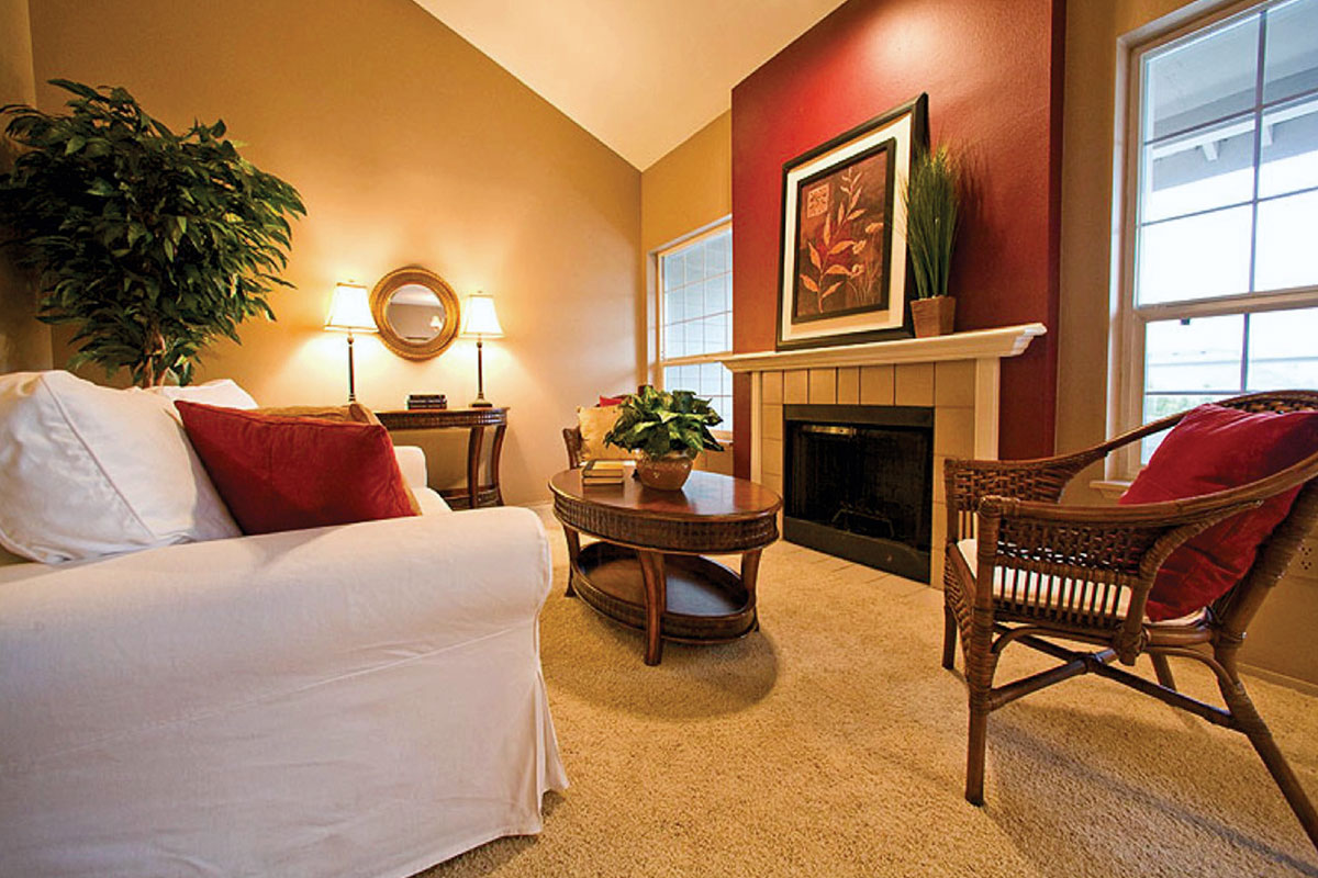
A coloured ceiling: dramatic when used with restraint
A rarer but very expressive move is a coloured ceiling. It requires courage and a good sense of scale, but when executed well, it can look unusual, expensive and highly designed. A coloured ceiling works especially well in entryways, powder rooms, dining rooms, children’s rooms, offices and smaller spaces where you want a jewel-box effect.
If the ceiling becomes the main colour accent, the walls are best kept light or painted in a calmer shade. White or ivory walls create visual pause and keep the interior from becoming heavy. For example, a deep blue ceiling with white walls can feel graphic and fresh, while a warm ochre or terracotta ceiling can add sunshine and depth to a room.
The main rule is not to paint both walls and ceiling the same saturated colour without a clear concept. In some interiors this can work, but more often it creates the effect of a room closing in, especially if the space is small or poorly lit. A neutral background helps a bright colour unfold and makes it expressive rather than oppressive.
Furniture: contrast, air and the right texture
If the wall is bright, the furniture should either contrast with it or remain calm and graphic. A white table against a saturated wall looks clean and modern. Black furniture adds drama. Natural wood softens bright colour and makes the room warmer. A light sofa can be brought to life with a coloured rug, pillows or a striking lamp without turning the living room into visual chaos.
It is important not to let furniture disappear against the wall. If you choose a green wall and a green sofa in almost the same shade, the interior can become muddy and heavy. It is better to play with differences in texture or tone: velvet against matte paint, dark wood against a bright background, white ceramics against a saturated wall, brass or chrome as a small light-catching accent.
Bright interiors especially benefit from quality materials. Cheap plastic textures often look even cheaper next to saturated colour. Wood, stone, linen, wool, ceramics, glass, metal and good textiles, however, make colour deeper and more refined. In an expensive interior, colour rarely exists alone - it is always supported by texture.
Two colours already make a composition
If you want to build an interior around two saturated shades, it is important to establish hierarchy immediately. One colour should be the lead; the other should support it. If both colours are equally active and occupy equal visual space, they will begin to compete.
Blue and yellow, for example, can look fresh and modern if blue works as the deep background and yellow appears in an armchair, poster or lamp. Green and lilac can create a subtle, almost botanical mood if one of the shades is softened. Terracotta and dark blue create a more mature, European atmosphere. Raspberry and olive can look bold, but they need a neutral background and good materials.
The main rule is simple: the brighter the shades, the less space they should occupy. One strong colour gesture is better supported by a few precise details than repeated in every corner of the room.
Light decides everything
A bright colour should never be chosen from a tiny sample in a store. The same shade will look completely different in the morning, in the evening, in northern light, under a warm lamp, next to a wooden floor or beside white tile. Before painting, test the colour on the wall and look at it at different times of day.
North-facing rooms often make colours feel cooler and stricter. Southern light intensifies warmth and saturation. Artificial lighting can turn a beautiful deep shade into something too sharp or too muddy. That is why an expensive-looking interior begins not with a can of paint, but with testing the colour in the actual space.
If a room is small and dark, that does not mean bright colour is forbidden. Sometimes a deep shade is exactly what makes a small space feel more expressive. But then you must honestly embrace the room’s intimacy instead of pretending it is large. In a small office, powder room or hallway, saturated colour can work beautifully if supported by the right lighting, a mirror, graphic furniture and calm details.
A bright interior does not have to be loud
The biggest myth about saturated colours is that they necessarily make a home loud and tiring. In reality, what tires the eye is not colour, but a lack of composition. When a room contains too many shades, small decorative objects, random prints and unrelated pieces, the space begins to feel noisy. But one strong colour, used confidently and with restraint, can feel calmer than a dozen beige objects that have no relationship to one another.
A bright interior can be intelligent, precise and very elegant. It requires not fear, but discipline: choose the main shade, give it space, support it with details, leave enough air and avoid overloading the room with unnecessary effects.
That is when bright colour stops being a risk. It becomes the character of the home - the element that makes a space feel alive, memorable and personal. In a good room, colour does not shout about the owner’s bravery. It simply shows that this home has mood, taste and a voice of its own.